
Importances of Image Optimization
Nowadays, with a plethora of images enriching web applications, optimizing them becomes paramount for maintaining a smooth user experience. In this guide, we’ll explore how to tackle this challenge within Next.js, a framework renowned for its efficiency in building modern web applications. We’ll delve into strategies for reducing load times, conserving bandwidth, and ensuring optimal display quality, empowering you to create web apps that not only look stunning but also perform flawlessly, even under heavy image loads. Whether you’re crafting an e-commerce platform, a media-rich blog, or any other image-intensive application, this guide will equip you with the tools and knowledge needed to master image optimization in Next.js.
Impact of Unoptimized Images on Website Performance
Unoptimized images can significantly impair website performance in several ways. Firstly, they lead to slower load times, as larger image files take longer to download and render. This delay frustrates users and increases bounce rates, negatively affecting user engagement and conversion rates. Additionally, unoptimized images consume more bandwidth, leading to higher hosting costs and potentially exceeding data limits for users on mobile or limited data plans.
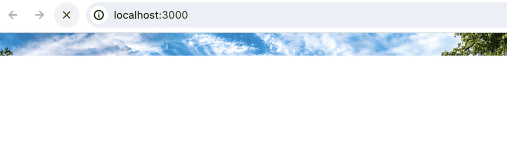
Let’s walk through an example, if your customers are in unstable network and wifi condition and your web’s has a lot a big size image.

Wow, users need 1 minute to see full the 10MB image, that is really not user-friendly. So in the next section we’ll see how to deal with this issue.
Image Component in NextJs
Here is the code of this issue above:
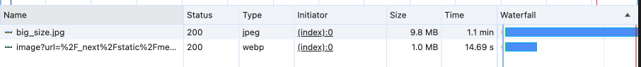
<img alt="" src="./big_size.jpg" />We get this result on browser.
You may have noticed that the browser takes a long time to load, and users may only see a part of an image while images are still being requested and wide white space below. Additionally, this could lead to Cumulative Layout Shift (CLS), which carries the risk of breaking the website’s layout and is not good for our users. Now, we’ll use the Next.js component to see the differences.
import Image from "next/image";
import BigImg from "./../public/big_size.jpg";

export default function Home() {
  return (
    <main>
      <img alt="" src="./big_size.jpg" />
      <Image src={BigImg} alt="" />
    </main>
  );
}
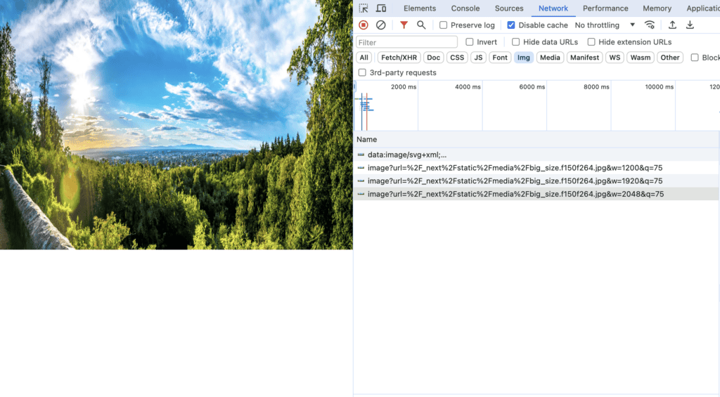
The second request to optimize Next.js’s server is about 5 times faster than the request made by the <img/> tag. So why is that? It’s because Next.js automatically serves correctly sized images for each device, using modern image formats like WebP and AVIF, which makes our images load so fast. By the way, how do we make our images have a user-friendly blur-up placeholder while loading, as shown below?

Just add placeholder’s prop:
"use client";
import Image from "next/image";
import BigImg from "./../public/big_size.jpg";

export default function Home() {
  return (
    <main>
      <Image src={BigImg} alt="" placeholder="blur" />
    </main>
  );
}
That looks great, but what happens if you want to request a resized image for laptops and mobile devices? Let’s go ahead and see how to solve that problem.
Optimization with Image Sizing
Let’s see how we render a responsive image for each device :
"use client";
import Image from "next/image";
import BigImg from "./../public/big_size.jpg";

export default function Home() {
  return (
    <main>
      <div style={{ height: "400px", position: "relative" }}>
        <Image src={BigImg} alt="" fill />
      </div>
    </main>
  );
}
Here is the result:
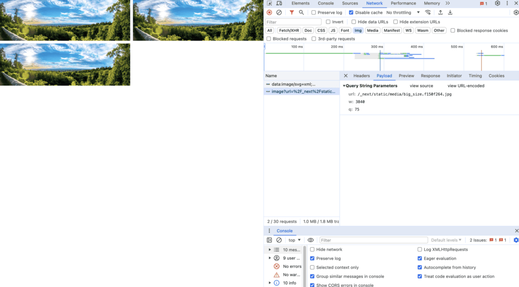
If you pass a fill prop to the <Image/> component, your image will automatically be requested correspondingly with your device. You can observe that the parameter ‘w’ in each request changes after resizing your viewport. As the viewport size decreases, the image’s size decreases accordingly. This approach is beneficial for rendering responsive images that stretch with the viewport. It’s important to note that the parent element must have the CSS style of either position: "relative", position: "fixed", or position: "absolute". For more information, you can read about it here.
What about for multiple image’s responsive?
For an example:
<main style={{ display: "flex", justifyContent: "center", columnGap: "50px" }}>
  <div className="grid grid-cols-1 sm:grid-cols-2 lg:grid-cols-3 gap-2">
    {/* Repeat same image 3 times */}
    <Image src={BigImg} alt="Mountains static image" placeholder="blur" />
    <Image src={BigImg} alt="Mountains static image" placeholder="blur" />
    <Image src={BigImg} alt="Mountains static image" placeholder="blur" />
  </div>
</main>
We have 3 images in a row on large device and 2 in medium 1 in small device. But in those 3 cases , browser only request for the biggest image’s size.
By specifying different sizes for the images based on viewport width, you’re optimizing the loading of the images. Instead of loading large images meant for desktop viewports on smaller devices, you’re instructing the browser to load appropriately sized images, reducing unnecessary bandwidth usage and improving performance.
...
<Image
  src={BigImg}
  alt="Mountains static image"
  placeholder="blur"
  sizes="(max-width: 640px) 100vw,(max-width: 1024px) 50vw,33vw"
  />
...
The sizes prop defines the width of the image at different breakpoints. For example, (max-width: 640px) 100vw specifies that when the viewport width is up to 640 pixels, the image should be requested by 100% of the viewport width. Similarly, (max-width: 1024px) 50vw indicates that between 641 pixels and 1024 pixels viewport width, the image should be requested by 50% of the viewport width, and so on.
Conclusion
In conclusion, image optimization in Next.js isn’t just about reducing file sizes or improving load times—it’s about creating a seamless and delightful browsing experience for your audience. So dive in, explore the possibilities, and elevate your Next.js projects to new heights with optimized images.
Reference:
– https://nextjs.org/docs/app/api-reference/components/image