
This article is a translation of the original Japanese article on Zenn: https://zenn.dev/moneyforward/articles/43bcef16b033f8.
Introduction
This article explains how we implemented and utilized a Model Context Protocol (MCP) server to efficiently provide component information of our design system MFUI to AI coding assistants.
Note that this article does not cover MFUI in detail. For more on MFUI, refer to Taiga Kiyokawa’s presentation on Money Forward UI at Money Forward TECH DAY’24 from our company’s tech event.
Also, for detailed information on the Model Context Protocol itself, please refer to the official documentation.
Purpose of the MCP Server
MFUI uses Storybook as its documentation platform, with usage details in each story and interface details in JSDoc. To enable AI coding assistants (like Cursor) to accurately understand and utilize this information, we built a system to provide component source code directly through an MCP server.
Architecture
The MFUI MCP server (mfui-developer-mcp) is implemented using the @modelcontextprotocol/sdk and provides three main tools:
- get_available_components: Retrieves a list of all available MFUI components.
- get_available_react_icons: Retrieves a list of all available MFUI icons.
- get_component_files: Given a component name, returns all files in that component’s directory.
Tech Stack
- Language: TypeScript
- Runtime: Node.js
- Dependencies:
@modelcontextprotocol/sdk: SDK for implementing the MCP serverzod: Library for input validation
MFUI Directory Structure
MFUI is managed as a monorepo with the following major packages and applications:
mfui/
├── apps/
│   └── mcp-server/          # Implementation of mfui-developer-mcp
│       ├── dist/
│       │   └── index.js     # Generated at build time, executed by MCP clients
│       ├── src/
│       │   └── index.ts     # Server implementation
│       └── package.json
│
├── packages/
│   ├── components/          # UI library
│   │   ├── src/
│   │   │   ├── Button/
│   │   │   ├── Checkbox/
│   │   │   ├── ... (other components)
│   │   │   └── index.ts      # Package entry point
│   │   └── package.json
│   │
│   └── icons-react/         # React icon components
│       ├── dist/
│       │   ├── ... (individual .tsx icon files)
│       │   └── index.ts     # Package entry point
│       └── package.json
│
└── package.json
Component Structure
Each component has the following file structure:
components/src/ComponentName/
├── ComponentName.tsx          # Component implementation
├── ComponentName.types.ts     # Type definitions
├── ComponentName.stories.tsx  # Storybook definitions
└── index.ts                   # Exports
Implementation Details
Since the repository is private, I’ll show some essential parts of the code here.
Fun fact: we implemented most of this using Cursor agents, with minimal human intervention.
Server Initialization
import { McpServer } from '@modelcontextprotocol/sdk/server/mcp.js';
import { StdioServerTransport } from '@modelcontextprotocol/sdk/server/stdio.js';

// Create server instance
const server = new McpServer({
  name: 'mfui-developer-mcp',
  version: '1.0.0',
  capabilities: {
    resources: {},
    tools: {},
  },
});
Tool: get_available_components
We read the export lines from packages/components/src/index.ts to extract component names, similarly for icons.
// Register get_available_components tool
server.tool('get_available_components', 'Get a list of available MFUI components', {}, async () => {
  const componentsIndexPath = path.join(rootDir, 'packages/components/src/index.ts');
  const componentsIndexContent = await fs.promises.readFile(componentsIndexPath, 'utf-8');

  // Extract component names from export lines
  const componentNames = componentsIndexContent
    .split('\n')
    .filter((line) => line.startsWith('export *'))
    .map((line) => {
      const match = line.match(/['"].\/(.+)['"]/);
      return match ? match[1] : '';
    })
    .filter((name) => name !== '');

  return {
    content: [
      {
        type: 'text',
        text: 'Available MFUI Components:\n\n' + componentNames.join('\n'),
      },
    ],
  };
});
Tool: get_component_files
This tool accepts a componentName argument validated with zod, reads all files in that component directory, and returns their contents.
// Register get_component_files tool
server.tool(
  'get_component_files',
  'Get files for a specific MFUI component',
  {
    componentName: z.string().describe('Name of the component to get information for'),
  },
  async ({ componentName }) => {
    const componentsDir = path.join(rootDir, 'packages/components/src');
    const componentPath = path.join(componentsDir, componentName);

    try {
      // Check existence
      await fs.promises.access(componentPath);

      // List files
      const files = await fs.promises.readdir(componentPath);

      // Read file contents
      const fileContents: Record<string, string> = {};
      for (const file of files) {
        const filePath = path.join(componentPath, file);
        try {
          const content = await fs.promises.readFile(filePath, 'utf-8');
          fileContents[file] = content;
        } catch (error) {
          fileContents[file] = `Error reading file: ${error instanceof Error ? error.message : String(error)}`;
        }
      }

      return {
        content: [
          {
            type: 'text',
            text:
              `Component: ${componentName}\n` +
              `Directory: ${componentPath}\n\n` +
              `Available files:\n${files.join('\n')}\n\n` +
              `File contents:\n\n` +
              Object.entries(fileContents)
                .map(([filename, content]) => `=== ${filename} ===\n${content}\n`)
                .join('\n'),
          },
        ],
      };
    } catch (error) {
      return {
        content: [
          {
            type: 'text',
            text: `Component "${componentName}" not found. Error: ${error instanceof Error ? error.message : 'Unknown error'}`,
          },
        ],
      };
    }
  }
);
Distributing the MCP Server
Typical distribution methods include:
- Publishing to a package registry and making it executable via CLI (e.g., Framelink Figma MCP)
- Distributing a Docker image (e.g., GitHub MCP Server)
- Sharing source code for users to clone and build locally
For mfui-developer-mcp, we chose the third option: sharing the source code directly. This approach reduces security concerns by avoiding automatic source code sharing and encourages contributors to clone the MFUI repo and engage directly.
Setup Instructions
- Clone the MFUI repository locally.
- Run a few commands to build the MCP server.
- Add the server configuration to your MCP client.
Example Configuration for Cursor
{
  "mcpServers": {
    "mfui-developer-mcp": {
      "command": "node",
      "args": [
        "/your/path/to/mfui/apps/mcp-server/build/index.js"
      ]
    }
  }
}
Use Cases
1. Component Implementation Support
Ask an AI how to use MFUI components:
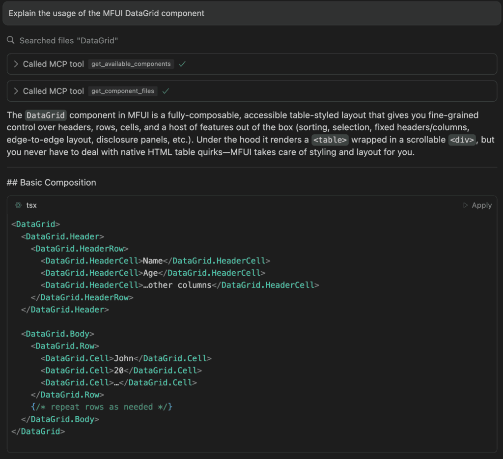
The AI can accurately explain usage examples and property details, greatly assisting development.
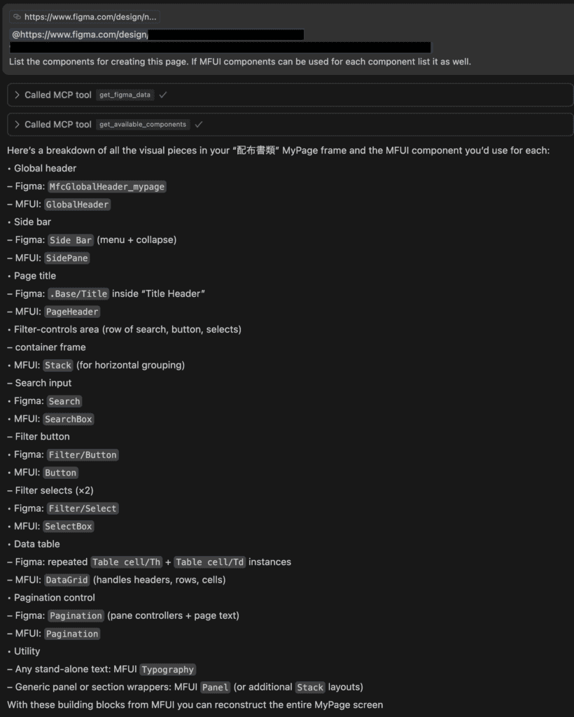
2. Integration with Figma Designs
Combine with Framelink Figma MCP Server to get MFUI component suggestions directly from design data.
Future Improvements
- Context Window Optimization
Currently,get_component_filesreturns full source code, which can be token-heavy. We plan to summarize usage details into documentation to reduce token usage while retaining debugging usefulness. - Integration with Other Resources
Link best practices and accessibility guidelines to help AI generate even better code incorporating MFUI. - Expanding Stakeholder Use
Extend MCP support beyond developers to designers and PMs, providing guidelines on design standards and principles in addition to component usage.
Conclusion
I introduced the efforts to MCP-enable the MFUI design system for internal use. By providing component information through an MCP server, I believe it can significantly boost developer productivity. I look forward to expanding use cases and making the tool valuable for a wider range of stakeholders, including designers and product managers. I hope these insights prove helpful to other teams and companies managing their own design systems.